Level Up Your Decisions With Product Comparison Charts
Choosing the right product for your Shopify store can feel overwhelming. With countless options available, how do you cut through the clutter and find the perfect fit? Product comparison charts offer a simple yet powerful solution. Whether you're evaluating email marketing platforms like Mailchimp or searching for the right inventory management system, comparison charts provide a structured approach to analyzing competing options and making informed decisions.
Comparing products side-by-side is a time-tested strategy. Think back to handwritten notes and complex spreadsheets. While the methods have evolved, the core principle remains: clearly visualize the strengths and weaknesses of different choices. Modern software and online tools have simplified the process, offering dynamic features, interactive elements, and seamless data integration.
What makes a product comparison chart effective? Clarity, conciseness, and relevance. A good chart focuses on the features most important to you, allowing you to quickly determine which product best aligns with your specific needs and budget. It helps you avoid feature overload and concentrate on what truly matters.
In this article, we'll explore the 10 best product comparison chart tools available. We'll delve into their unique features, benefits, and drawbacks. By the end, you'll have the knowledge to choose the perfect tool to empower your decision-making and optimize your Shopify success.
Microsoft Excel For Product Comparisons
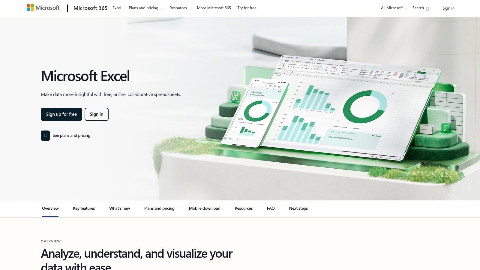
Microsoft Excel is a powerful spreadsheet program ideal for creating product comparison charts. While not specifically designed for e-commerce, its flexibility makes it a great option, especially for Shopify merchants already using Microsoft 365.
Excel is helpful for comparing products in your own inventory or analyzing competitors. Easily compare features, pricing, and profit margins of different products, or track competitor pricing. Excel's data analysis tools help you uncover deeper insights.
Features and Benefits
- Built-In Templates: Start quickly with pre-built comparison chart templates.
- Data Visualization: Create clear visuals like bar graphs and charts to highlight key differences.
- Conditional Formatting: Automatically highlight price discrepancies or shipping costs.
- Formulas: Perform calculations to compare profit margins or ROI.
- Microsoft 365 Integration: Seamlessly import data from other Microsoft applications.
Pros of Using Excel
- Versatile: Excel handles simple and complex product comparisons.
- Familiar Interface: Most users are already familiar with how Excel works.
- Powerful Analysis: Go beyond basic comparisons with features like pivot tables.
- Wide Compatibility: Easily share your comparison charts.
Cons of Using Excel
- Learning Curve: Advanced features require time and effort to learn.
- Cost: Full functionality usually requires a Microsoft 365 subscription.
- Complexity: Simpler tools might be better for basic comparisons.
Implementation Tips
- Start with a Template: Excel offers pre-designed templates for a quick start.
- Use Conditional Formatting: Highlight key differences for visual impact.
-
Learn Basic Formulas: Formulas like
=IF,=SUM, and=AVERAGEcan improve your analysis.
Pricing and Technical Requirements
Excel is part of the Microsoft 365 suite, with various subscription plans. Free online versions have limited features. Visit the Microsoft website for pricing details. Excel is compatible with Windows, macOS, iOS, and Android.
By using Excel's features, Shopify merchants can gain product insights to optimize their offerings, improve marketing, and boost profits.
Lucidchart
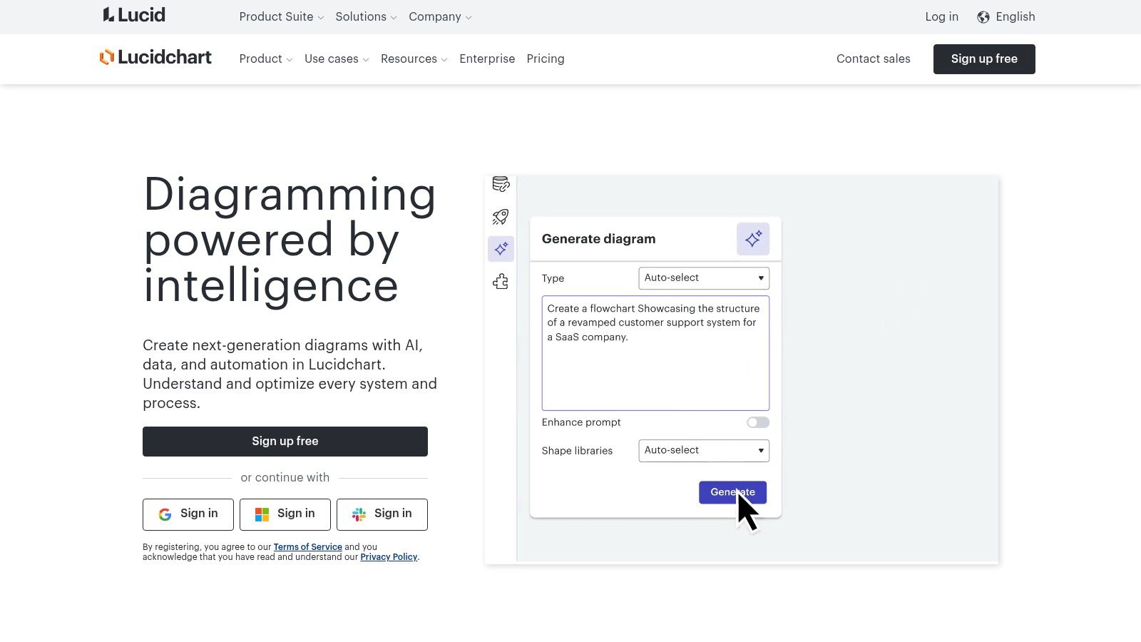
Lucidchart is a cloud-based visual workspace. It's perfect for creating professional product comparison charts. Shopify merchants can easily visualize product options, bundles, and pricing tiers. These charts can be used internally or shared with customers. Imagine clearly mapping out key features of your Shopify products. This helps your team understand the differences. You can also create a simple comparison matrix to guide customers toward the right purchase.
The drag-and-drop interface makes building charts simple. You don't need design or coding skills. Pre-built templates for product comparisons help you get started quickly. This saves you time and effort. Lucidchart is also great for teamwork. Its real-time collaboration features allow teams to work on charts together. This makes product decisions more efficient. It's especially helpful when comparing products across departments like marketing, sales, and product development.
Key Features and Benefits
- Drag-and-drop interface: Create charts quickly and easily.
- Cloud-based: Access your work from anywhere.
- Real-time collaboration: Work together with your team seamlessly.
- Pre-built templates: Get a head start on your product comparisons.
- Integrations: Connect with tools like Google Workspace and Microsoft Office 365.
Pros and Cons of Using Lucidchart
Pros:
- Intuitive: Easy to learn and use, even for beginners.
- Collaborative: Real-time editing and comments make teamwork simple.
- Professional Output: Create visually appealing charts.
- Cross-Platform: Works in any web browser on any device.
Cons:
- Limited Data Analysis: Lucidchart is primarily for visualization. Use it with a spreadsheet program for complex data analysis.
- Paid Subscription for Full Features: A free version is available, but a subscription unlocks all features and templates.
- Not Ideal for Data-Heavy Comparisons: Spreadsheets are better for charts with lots of numerical data.
Pricing and Technical Requirements
Lucidchart has different pricing tiers, including a free version. Paid plans offer more features and collaboration capabilities. Check their website for current pricing.
As a cloud-based app, Lucidchart requires an internet connection and a web browser. No software installation is needed.
Why Choose Lucidchart?
Lucidchart offers a user-friendly way to create product comparison charts. You don't need technical expertise. The collaborative features are great for teams. If you need to visualize product comparisons efficiently, Lucidchart is a good choice.
Website: https://www.lucidchart.com
Tableau
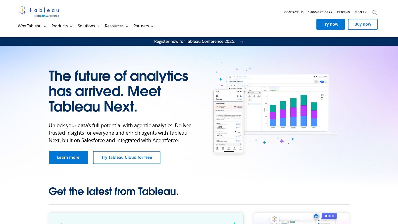
Tableau is a powerful tool for visualizing data. It’s perfect for building interactive and detailed product comparison charts. Its main strength is turning complex data into easy-to-understand visuals. This makes it valuable for Shopify merchants who need detailed product analysis or want to present clear comparisons to stakeholders.
Imagine trying to understand how different product categories perform in your Shopify store. You might want to compare sales, conversion rates, and average order value. Tableau can connect directly to your Shopify data (though some extra setup might be needed). It lets you build dynamic dashboards to see these metrics side-by-side.
You can filter by date range, product attributes, or even customer demographics. This gives you precise insights into what drives sales and where you can improve. You can even visualize customer feedback alongside product features. This helps you pinpoint which aspects resonate with your audience and which need work.
Key Features of Tableau
- Interactive Visualizations: Explore data dynamically using clickable charts and filters, allowing you to delve into specific product details.
- Multiple Data Sources: Integrate data from Shopify with other sources, such as marketing campaign performance or customer surveys, for a complete picture.
- Advanced Filtering: Filter data based on various criteria to uncover nuanced product comparisons.
- Dashboard Creation: Build interactive dashboards showing multiple product comparisons at once for a comprehensive view of product performance.
- Data Blending: Combine data from different sources (like Shopify sales and Google Analytics traffic data) to create richer comparisons.
Pros of Using Tableau
- Highly Interactive Visuals: Dive deep into your product data with ease.
- Excellent For Data-Rich Comparisons: Handles large datasets and complex comparisons effectively.
- Presentation-Ready Output: Creates professional charts and dashboards perfect for reports and presentations.
- Handles Large Datasets: Easily manages and analyzes large volumes of product data.
Cons of Using Tableau
- Costly For Small Businesses: Tableau's licensing fees can be a barrier for smaller Shopify stores. Google Data Studio is a budget-friendly alternative.
- Steeper Learning Curve: Mastering Tableau’s advanced features takes time and effort.
- Potentially Overkill: Simpler tools might be sufficient for basic product comparisons.
Website: Tableau
Tips For Implementing Tableau
- Define Your Objectives: Before starting, know exactly what you want to learn from your product comparisons.
- Prepare Your Data: Make sure your Shopify data is accurate and organized before importing it into Tableau.
- Use Online Resources: Take advantage of Tableau's tutorials and resources to learn the basics and more advanced techniques.
- Consider Tableau Public: Tableau Public is a free version with some limitations on sharing data. It may be suitable for some Shopify merchants.
Tableau's robust features and interactive visualizations make it a strong choice. The cost and learning curve are higher than some other tools. However, its ability to handle complex data and create insightful visualizations makes it a powerful tool. It's ideal for Shopify businesses looking to improve their product analysis.
Google Sheets for Product Comparisons
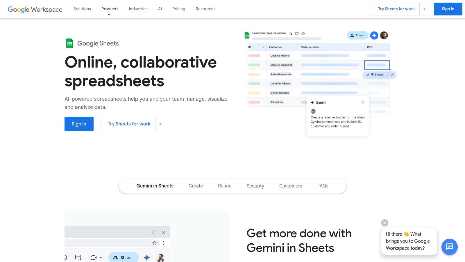
Google Sheets is a powerful, free tool for creating product comparison charts. Its collaborative features make it especially useful for Shopify merchants working with teams or virtual assistants. Multiple team members can update pricing, features, or competitor information simultaneously, all within the same spreadsheet.
This real-time collaboration eliminates version control issues and speeds up decision-making.
Google Sheets provides the necessary tools for building detailed comparison charts. You can create tables, use conditional formatting to highlight key product differences (like the lowest price), and generate charts to visualize your data. These visuals are helpful when analyzing competitor products or positioning your own.
Using Google Sheets for Shopify
For Shopify stores, Google Sheets can be used for various tasks:
- Comparing Competing Products: Analyze pricing, features, and customer reviews. This helps you identify opportunities and improve your product strategy.
- Tracking Product Performance: Monitor sales, conversion rates, and average order value across different products.
- Managing Inventory: Track stock levels in real-time and collaborate with suppliers.
- Planning Marketing Campaigns: Compare different marketing channels and track campaign performance.
Features of Google Sheets
- Real-time collaboration
- Cloud-based access
- Chart and table creation tools
- Conditional formatting
- Free for basic use
Pros of Using Google Sheets
- Excellent Collaboration: Perfect for teams making product decisions together.
- Free Basic Features: Budget-friendly, especially for startups and small businesses.
- Accessible From Any Device: Work on your comparison charts from anywhere.
- Seamless Google Workspace Integration: Easily import data from other Google services like Google Analytics.
Cons of Using Google Sheets
- Less Powerful Than Excel: While good for most comparisons, it lacks Excel’s advanced statistical functions. For more complex analysis, consider Microsoft Excel.
- Limited Offline Capabilities: Requires an internet connection for full functionality.
- Fewer Specialized Templates: You may need to create your chart from scratch, although free templates are available online.
Website
Implementation Tips
- Start With a Template: Search online for "product comparison chart Google Sheets template" to save time.
- Use Conditional Formatting: Highlight important data points automatically, like price differences or best-selling products.
- Explore Add-ons: Extend Google Sheets functionality with add-ons for tasks like importing data or creating advanced charts.
Google Sheets offers a strong combination of functionality, accessibility, and collaboration. This makes it a useful tool for any Shopify merchant who wants to compare products and make informed decisions.
Canva for Creating Product Comparison Charts
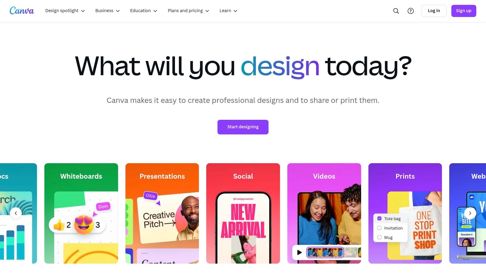
Canva is a great choice for creating visually appealing product comparison charts. It's especially popular with Shopify merchants who want attractive visuals and find ease of use important. While perhaps not suited for in-depth data analysis, Canva excels at transforming product information into engaging graphics. These visuals are perfect for marketing, social media, or even embedding directly into your Shopify store.
Let's say you need a quick comparison chart to highlight the differences between your new organic teas. With Canva, you can choose a pre-designed product comparison template. Then, customize it with your product information, brand colors, and fonts. You'll have a professional-looking chart ready to go in minutes. This is a big plus for busy entrepreneurs who may not have design experience or the budget for a professional designer.
Canva's drag-and-drop interface is incredibly intuitive. The brand kit feature helps you maintain consistent styling across all your marketing. Plus, a huge template library offers lots of layout options. Easy sharing and export options make it simple to distribute your charts across different platforms. You can even collaborate with team members on designs.
Features
- Drag-and-drop design interface
- Extensive template library
- Brand kit for consistent styling
- Easy sharing and export options
- Collaboration capabilities
Pros
- User-friendly, even for non-designers
- Professional-looking results
- Many free templates
- Excellent for visual presentations
Cons
- Limited data handling capabilities
- Not ideal for complex data analysis
- Some advanced features require a paid subscription (Canva Pro and Canva for Teams)
Pricing
Canva has a free plan with plenty of resources. Paid plans offer more features, stock photos, and team functionalities.
Implementation Tips for Shopify Merchants
- Product Photography: Use high-quality product images from your Shopify store to create visually appealing comparisons.
- Brand Consistency: Use Canva's brand kit to keep your fonts, colors, and logos consistent.
- Embed in Shopify: Save your Canva chart as a PNG or JPG and embed it in your product descriptions or a dedicated comparison page on your Shopify store.
- Social Media Marketing: Design eye-catching comparison charts optimized for social media to showcase your products and boost traffic to your Shopify store.
Comparison with Similar Tools
Compared to spreadsheet software like Excel or Google Sheets, Canva focuses on visual presentation rather than complex data analysis. Spreadsheets are better for managing large datasets and performing calculations, but Canva is the winner when it comes to making attractive, easy-to-understand charts for your customers.
Website
Airtable for Product Comparisons
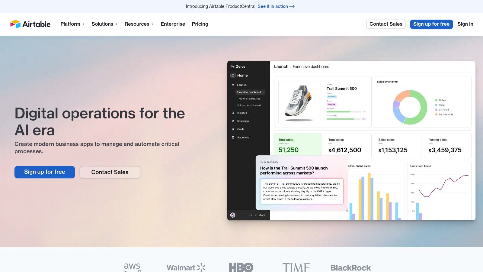
Airtable is a unique tool that combines the simplicity of a spreadsheet with the power of a database. This makes it a great option for building visual product comparison charts. Shopify merchants can use it for internal product analysis, competitor research, or even interactive customer displays.
Imagine easily comparing phone cases in your Shopify store. With Airtable, you can create a chart listing each case’s material, compatibility, price, and supplier. You can even include images and 3D models. This gives you a clear overview of your products and helps you spot opportunities.
Airtable's "views" feature allows you to look at the same data in different ways. See your phone case data in a grid, a gallery, or even a Kanban board to track inventory. This flexibility goes far beyond traditional spreadsheets.
Key Features and Benefits
- Flexible Database: Customize fields to fit your product attributes.
- Multiple Views: Display data in grids, galleries, Kanban boards, calendars, and forms.
- Rich Field Types: Include images, attachments, links, and checkboxes.
- Visualizations: Use blocks to add charts and maps.
- Integrations: Connect with other tools like Zapier or Integromat.
This customization allows you to tailor Airtable to your specific comparison needs. The platform combines visual appeal with robust data organization, creating informative and engaging charts. Airtable also excels at team collaboration, allowing multiple users to access and edit data simultaneously. You can even automate data entry and updates.
Considerations and Pricing
While Airtable offers a free plan, it has limits on records and attachments. For larger catalogs, a paid plan might be necessary. Also, setting up Airtable is more complex than a simple spreadsheet and takes some learning. The many features can feel overwhelming at first.
Paid plans start at $10 per user per month. Remember that pricing can change, so check the Airtable website for the latest information. Airtable is cloud-based and accessible through a web browser or mobile apps.
Tips for Shopify Merchants
- Templates: Start with pre-built templates for product catalogs.
- Data Import: Import existing product data from CSV files.
- Linked Records: Connect your comparison chart to other Airtable bases.
- Visualizations: Use the "Blocks" feature to visualize your product data.
Compared to basic spreadsheets like Google Sheets, Airtable offers greater flexibility and richer features. It's a powerful solution for businesses that need a customizable and scalable system.
Airtable helps Shopify merchants go beyond basic product comparisons. Its customizable structure, visuals, and collaborative features provide a powerful platform for managing and analyzing product data, leading to better decisions and a more successful business.
Smartsheet for Shopify Sellers
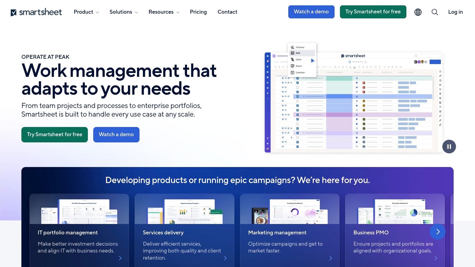
Smartsheet stands out from basic product comparison tools. It offers robust project management features integrated with its comparison capabilities, making it a powerful solution for Shopify sellers. Think about comparing shipping providers, marketing software, or even new product lines while simultaneously tracking progress and managing related tasks. Smartsheet excels in this area.
Smartsheet goes beyond static comparisons, allowing you to create dynamic documents that drive action. You could compare different marketing automation platforms based on features, pricing, and integrations, for example. Then, assign tasks for trial sign-ups, platform testing, and final decision-making, all within Smartsheet. This keeps your product research, comparisons, and project management centralized.
Features and Benefits for Shopify Sellers
- Multiple Views: Visualize your product comparison data in various formats, including Gantt, Grid, Card, and Calendar views. Choose the view that best suits your current needs.
- Automated Workflows: Automate tasks like updating pricing, sending review notifications, or even triggering purchase orders.
- Forms for Data Collection: Gather standardized product information from team members, suppliers, or customer surveys, feeding data directly into your comparison charts.
- Rich Cell Formatting: Highlight key differences, color-code options, and visually organize your comparisons for easy understanding.
- Integrated Project Management: Manage project tasks, deadlines, and communication alongside your product comparisons, eliminating the need for separate tools.
Pros
- Combines comparisons with action tracking.
- Strong collaboration features.
- Automation reduces manual updates.
- Enterprise-grade security.
Cons
- Cost: Subscriptions can be expensive. Check the Smartsheet website for current pricing.
- Learning Curve: Smartsheet is feature-rich, so new users may need time to learn the platform.
- Feature Overlap: For basic comparisons, a simple spreadsheet program might be sufficient.
Implementation Tips
- Start with a Template: Smartsheet offers pre-built templates for product comparisons and project management.
- Define Your Criteria: Before comparing products, identify the key features and factors important to your decision.
- Use Automation: Explore Smartsheet's automation features to streamline your workflow.
Comparison with Similar Tools
While similar to Airtable and Monday.com in project management, Smartsheet often offers more advanced automation and reporting features. This makes it suitable for complex projects and enterprise use.
Website: https://www.smartsheet.com
Smartsheet is a valuable tool for Shopify sellers wanting to go beyond basic spreadsheets. It integrates product comparisons into a robust project management workflow. While it has a steeper learning curve and higher price than some alternatives, its powerful features and automation make it a worthwhile investment for those needing more than basic comparison functionality.
Piktochart for Shopify Merchants
Piktochart helps Shopify merchants create attractive product comparisons. It transforms complex information into easy-to-understand infographics. This is a powerful way to boost marketing and improve customer understanding. Forget dense text and tables. Piktochart uses visuals, icons, and concise descriptions to showcase product differences, leading to more sales.
Let's say you sell smartwatches on Shopify. A typical comparison chart can quickly overwhelm customers with columns of features. Piktochart lets you design an infographic highlighting key differences. You can visually compare battery life, screen size, water resistance, and other important features. This visual format is more engaging and easier for customers to understand, especially on product pages or social media.
Features and Benefits
- Infographic Templates: Start quickly with pre-built templates designed for product comparisons.
- Visual Storytelling: Make complex information clear and engaging through visuals.
- Easy Customization: Adjust templates to your brand with simple drag-and-drop tools.
- Brand Kit: Ensure consistent branding with easy access to your logos, fonts, and colors.
- Download Options: Export charts in various formats (PNG, JPG, PDF) for different uses.
Pros and Cons
Here’s a quick look at the advantages and disadvantages of using Piktochart:
| Pros | Cons |
|---|---|
| Creates engaging, visual comparisons | Limited data handling compared to spreadsheets |
| Easier for non-technical audiences | Free version has export restrictions |
| Templates save design time | Less suited for internal, analytical comparisons |
Pricing and Implementation
Piktochart offers both free and paid plans. Paid plans give you more templates, customization options, and higher resolution downloads. Visit the Piktochart website for current pricing.
Here are some helpful tips for using Piktochart effectively:
- Use Templates: Start with a template to save time and create a professional look.
- Keep it Concise: Focus on the key differences to avoid overwhelming customers.
- High-Quality Images: Use clear and attractive product images.
- Brand Consistency: Use your brand’s colors, fonts, and logo.
Why Piktochart is Valuable
Piktochart provides a user-friendly way to create visual product comparisons. It’s a great tool for improving marketing, simplifying customer decisions, and boosting sales. While not a data analysis tool, its visual communication strength makes it a valuable asset for any Shopify business.
Notion: The All-In-One Workspace for Product Comparisons
Notion is a powerful workspace for Shopify merchants. It allows you to create detailed product comparison charts. While there's a learning curve, the flexibility makes it worth the effort. This is especially true for complex product evaluations.
Imagine centralizing all your product research and marketing strategies in one place. No more scattered spreadsheets! Notion brings everything together. You can build a comprehensive product comparison chart within your project documentation. This includes images, pricing, supplier links, and even marketing mockups.
Notion’s database functionality is key to its comparison charting strength. You can create tables with customizable properties (columns). These properties can include things like "Price," "Shipping Cost," "Supplier," and "Profit Margin." You can even add "Customer Reviews." These properties can hold different types of content. This includes numbers, text, images, and links. Need a different view? Easily switch between table, gallery, or list views.
Key Features of Notion
- Flexible Database Views: Choose from table, gallery, and list views to suit your comparison style.
- Rich Content Embedding: Add images, files, and links directly into your charts.
- Workspace Connection: Link charts to project notes, meeting minutes, and other documents.
- Customizable Properties: Tailor comparison criteria to your specific needs.
- Collaboration Tools: Work with your team in real time and use comments to discuss comparisons.
Pros of Using Notion
- Seamless Integration: Combine comparisons with other project documentation. Everything stays organized and accessible.
- Adaptable Workflow: Customize properties and views to match your exact requirements.
- Contextualized Comparisons: See how product choices impact other project areas.
- Team Collaboration: Facilitate shared decision-making and improve team communication.
Cons of Using Notion
- Initial Setup: Planning and structuring your databases is crucial for success.
- Feature Overload: The wide range of features can be overwhelming at first.
- Learning Curve: Some advanced features, like formulas and complex databases, require dedicated learning.
Pricing and Technical Requirements
Notion offers a free plan with limitations. Paid plans begin at $8/month per user (billed annually). The free plan is often enough for individual users or small teams. Notion is web-based and accessible from any modern browser. Desktop and mobile apps are also available.
Implementation Tips for Shopify Merchants
- Start with a Template: Notion offers pre-built templates for product comparisons to save you time.
- Define Key Criteria: Before creating your database, identify important factors like price, shipping, and features.
- Utilize Relations and Rollups: Connect your comparison chart to other databases. Examples include inventory management or marketing campaigns. This helps you get a holistic view of your business.
Website
Visme: Creating Stunning Product Comparisons
Visme is a visual content creation platform perfect for building engaging product comparison charts. Many tools simply organize data. Visme goes further, combining data and design. This makes it a great choice for Shopify merchants looking to present product information beautifully. Think polished comparison charts for your website, interactive sales presentations, or striking infographics for social media—Visme lets you create them all.
Visme's comparison chart templates give you a head start. Instead of a blank slate, choose a pre-designed template. Customize it to fit your needs and brand. This is helpful for Shopify merchants without dedicated design resources. Visme's brand kit integration makes it easy to add your logo, colors, and fonts.
Visme takes charts beyond static displays, adding interactivity. Include hover effects to reveal extra product details or clickable buttons leading to product pages. These interactive features boost engagement and potentially drive conversions on your Shopify store.
Features and Benefits
- Specialized Comparison Chart Templates: Quickly create professional-looking charts.
- Data Visualization Tools: Present data clearly and effectively.
- Brand Kit Integration: Maintain consistent branding.
- Interactive Elements Capability: Engage your audience.
- Presentation and Infographic Modes: Create various content formats.
Pros
- Professional Design Quality Without Design Skills: Visme’s user-friendly interface makes design easy.
- Versatile Output Formats for Different Channels: Export charts in various formats for websites, presentations, and social media.
- Good Balance of Data Handling and Visual Appeal: Visme combines data organization with strong visuals.
- Interactive Features for Online Comparisons: Engage customers with interactive elements to encourage purchases.
Cons
- Free Plan Has Significant Limitations: Access to advanced features requires a paid subscription.
- Not as Robust for Pure Data Analysis: Visme focuses on presentation, not deep data analysis. For in-depth analysis, consider dedicated spreadsheet software like Microsoft Excel or Google Sheets.
- Some Advanced Features Require Time to Master: While user-friendly overall, some features have a learning curve.
Website: Visme
Implementation Tips for Shopify Merchants
- Embed Charts on Product Pages: Help customers make informed choices.
- Create Interactive Buying Guides: Let customers filter and compare products.
- Enhance Social Media Content: Drive traffic with eye-catching visuals.
Visme offers several subscription tiers. Pricing details are available on their website and vary based on the plan. Choose the plan that aligns with your budget and feature needs. As a cloud-based platform, Visme is accessible through any web browser.
Top 10 Tools: Head-to-Head Comparison
| Platform | Core Features (✨) | User Experience (★) | Value Proposition (💰) | Target Audience (👥) |
|---|---|---|---|---|
| Microsoft Excel | Templates, formulas, pivot tables, conditional formatting | Powerful but complex ★★★ | Versatile analysis; premium cost | Analysts, professionals |
| Lucidchart | Drag‑and‑drop, real‑time collaboration, specialized templates | Intuitive & smooth ★★★★ | Quick visualizations; subscription required | Teams, business users |
| Tableau | Interactive dashboards, multi‑source connectivity, filtering | Engaging & advanced ★★★★ | Data‑rich insights; premium pricing | Data analysts, enterprises |
| Google Sheets | Cloud‑based, real‑time collaboration, chart creation | Simple & accessible ★★★ | Free core features; seamless integration | Teams, casual users |
| Canva | Drag‑and‑drop design, extensive template library | User‑friendly & visually appealing ★★★★ | Creative design with freemium options | Marketers, non‑designers |
| Airtable | Flexible database, multiple view options, rich field types | Customizable & collaborative ★★★★ | Versatile organization; freemium model | Project teams, organizers |
| Smartsheet | Project views (grid, Gantt, calendar), automation, forms | Robust yet learning curve ★★★ | Integrated workflows; subscription‑based | Business teams, enterprises |
| Piktochart | Infographic templates, visual storytelling, easy customization | Engaging & clear ★★★★ | Fast, design‑focused; freemium options | Marketers, communicators |
| Notion | Flexible databases, rich content embedding, customizable properties | Adaptable & collaborative ★★★★ | All‑in‑one workspace; freemium with upgrades | Project teams, content creators |
| Visme | Comparison charts, interactive visuals, brand kit integration | Professional & polished ★★★★ | Versatile design output; freemium with premium plans | Marketers, visual communicators |
Choosing The Right Chart Tool
With so many product comparison chart tools available, picking the right one can be tough. Here's how to narrow down your options:
-
Complexity: Simple comparisons (like using Excel or Google Sheets) work well for internal use or basic product differences. For more visual or interactive charts, explore dedicated tools like Tableau or Lucidchart.
-
Implementation: Need to get started quickly? Canva and Piktochart offer easy-to-use templates. For a more advanced, data-driven solution, consider Airtable or Smartsheet.
-
Budget and Resources: Free tools like Google Sheets and Excel are great starting points, especially with in-house design help. Paid tools offer more features but cost money. Think about long-term costs and value.
-
Integration and Compatibility: Your chosen tool should fit your current workflow. For Shopify merchants, consider how easily charts embed within your store.
Key Advantages of Comparison Charts
Product comparison charts are powerful for driving sales. They help customers make informed decisions. The best tool for you depends on your needs, resources, and technical skills. This could range from simple spreadsheets to sophisticated visualization platforms.
Streamline Your Comparisons with Section Store
Ready to boost conversions on your Shopify store? Skip complicated chart creation and showcase products beautifully with pre-designed comparison sections from Section Store. Add professional, conversion-optimized sections with a single, low fee (no subscriptions!). See our Shopify sections at Section Store.


